Corporate ideals...
Responsible, Harmonic, Respectful, Traditional, Restorative, High-end, Proud
A tree was one of the image preferences of the client, and whilst keeping in mind their comment ‘the tree of life is over used’, I began to look at ways of incorporating a tree into the logo steering away from clichés. Trenethick begins with the letter ‘T’ which has a basic tree shape. I added elements to a traditional serif typeface, which are associated with class and importance, perfect for an upmarket business. The branch and leaves acknowledges the wild and natural side of the business, while the ‘T’ stands with integrity.
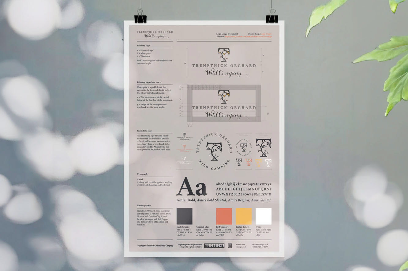
Greys were the colours requested by the client during the interview, so I began to develop a colour palette from images of slate, a common stone quarried in Cornwall. I thought it best to add colour to the palette, especially for use in marketing and communications. I used a yellow to hint at Cornish colours (black and yellow) and a secondary colour of an Autumnal red, which came from the idea of a camp fire.
Greys were the colours requested by the client during the interview, so I began to develop a colour palette from images of slate, a common stone quarried in Cornwall. I thought it best to add colour to the palette, especially for use in marketing and communications. I used a yellow to hint at Cornish colours (black and yellow) and a secondary colour of an Autumnal red, which came from the idea of a camp fire.


