Corporate ideals...
Authentic, Contemporary, Open, Liberal, Cultured, Modern, High-end, Artisinal
According to an ancient legend, Quetzacoatl, the feathered serpent god, was the patron saint of priests and was related to the cycle of life, death, and rebirth. Quetzacoatl gave the role of guardians of temazcal to women.
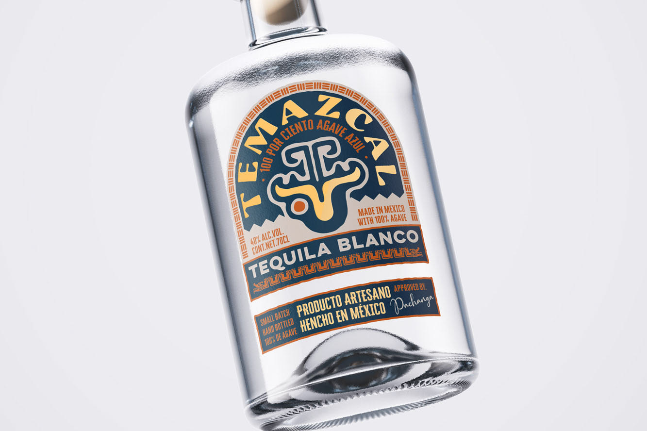
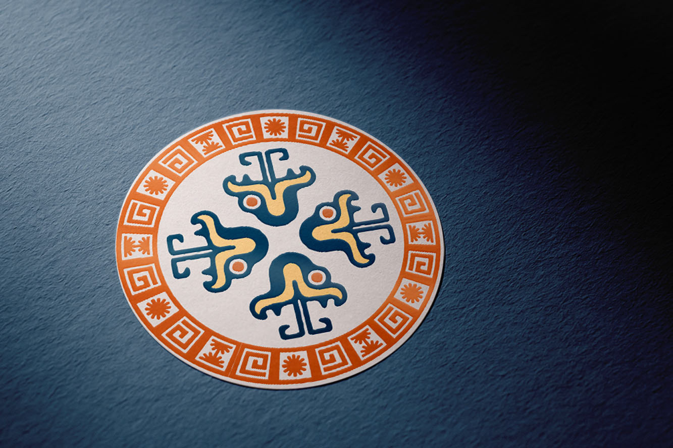
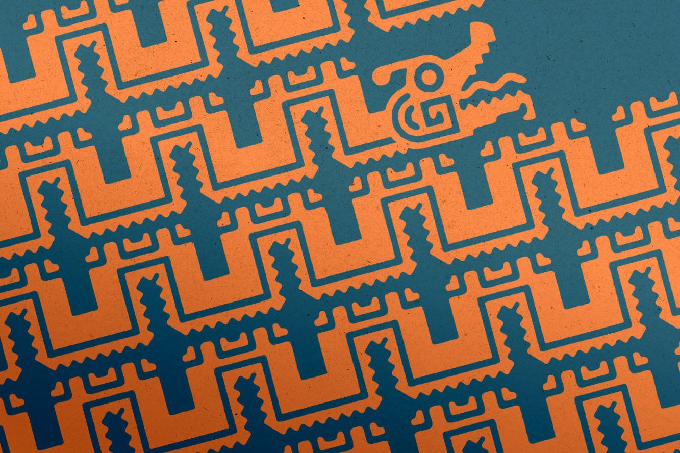
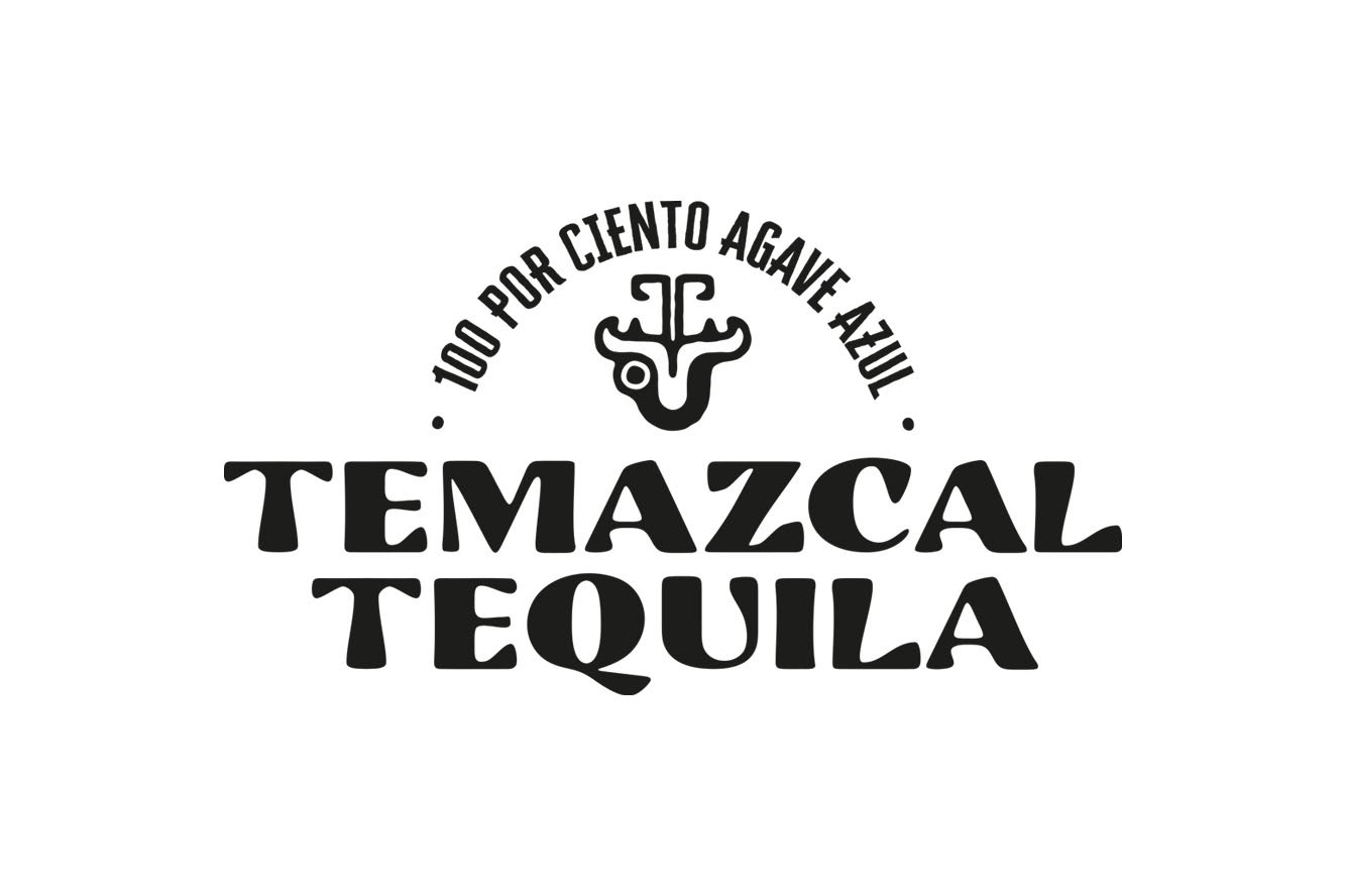
Quetzacoatl, meaning feathered serpent, is a god that takes many forms. I wanted to develop a logomark that would hint at this shape shifting deity in a style that resembles an Aztec wall carving and all whilst remaining easily reproducible. While designing the logo mark, the challenge was to reduce the complexity of the deity to a simple mark appropriate for the product.
Illustrations from The Codex Laud, a sixteenth-century pictorial manuscript from Central Mexico, were perfect inspiration. The lined drawings are visually impactful and use natural yet vivid colour combinations. I emulated the serpents head and added a forked tongue to represent the ‘T’ of Temazcal.
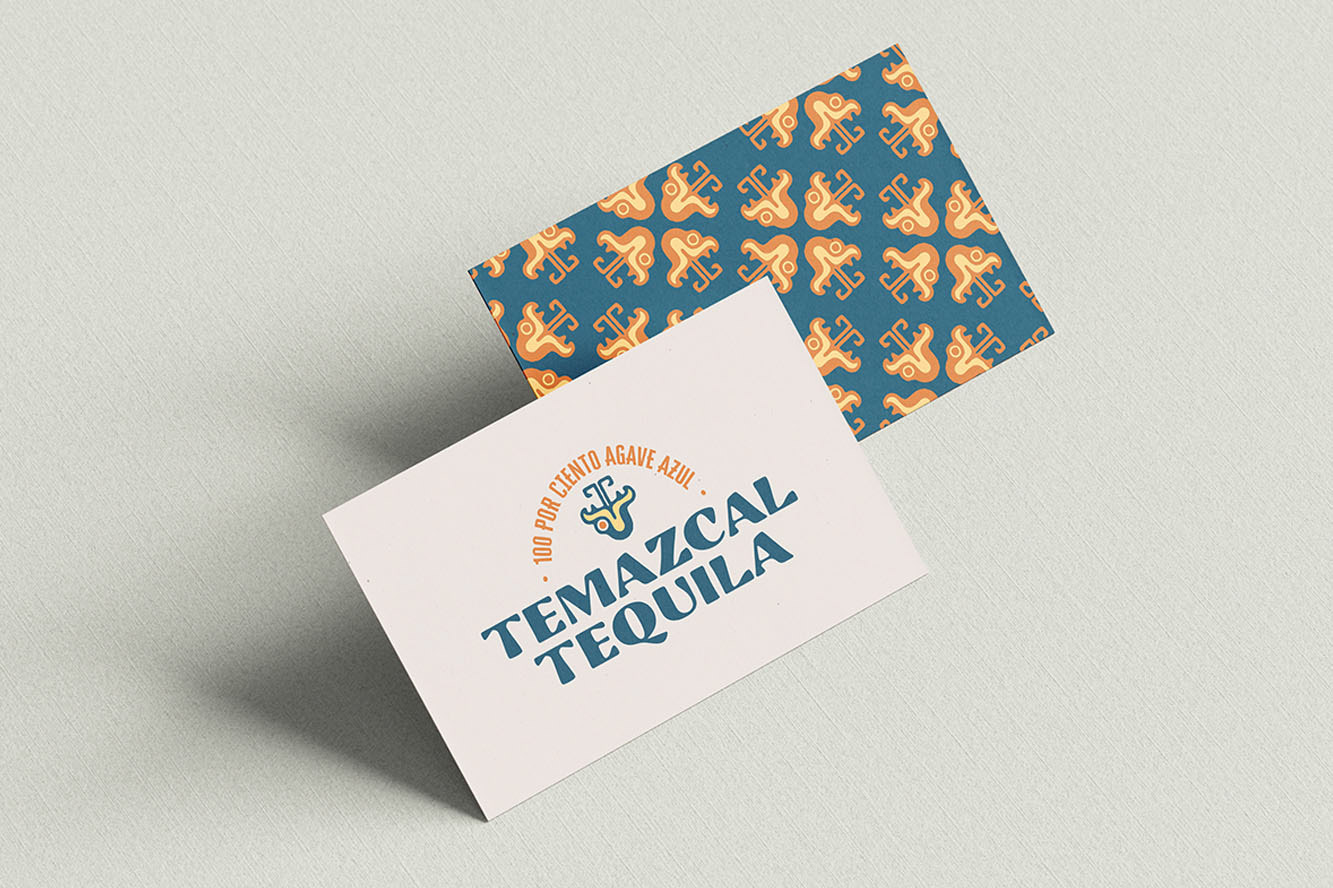
It is important for the word mark to be clear and bold when competing against other brands. Using some of the imagery provided by the client I began searching through typefaces that encompassed the brand and everything discussed in the brief.
