Corporate ideals...
Strong, Accurate, Professional, Technical, Commanding, Durable, Competitive, Protective, Secure, Masculine, Contemporary
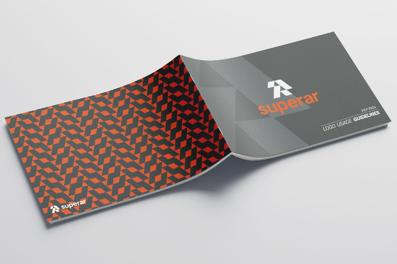
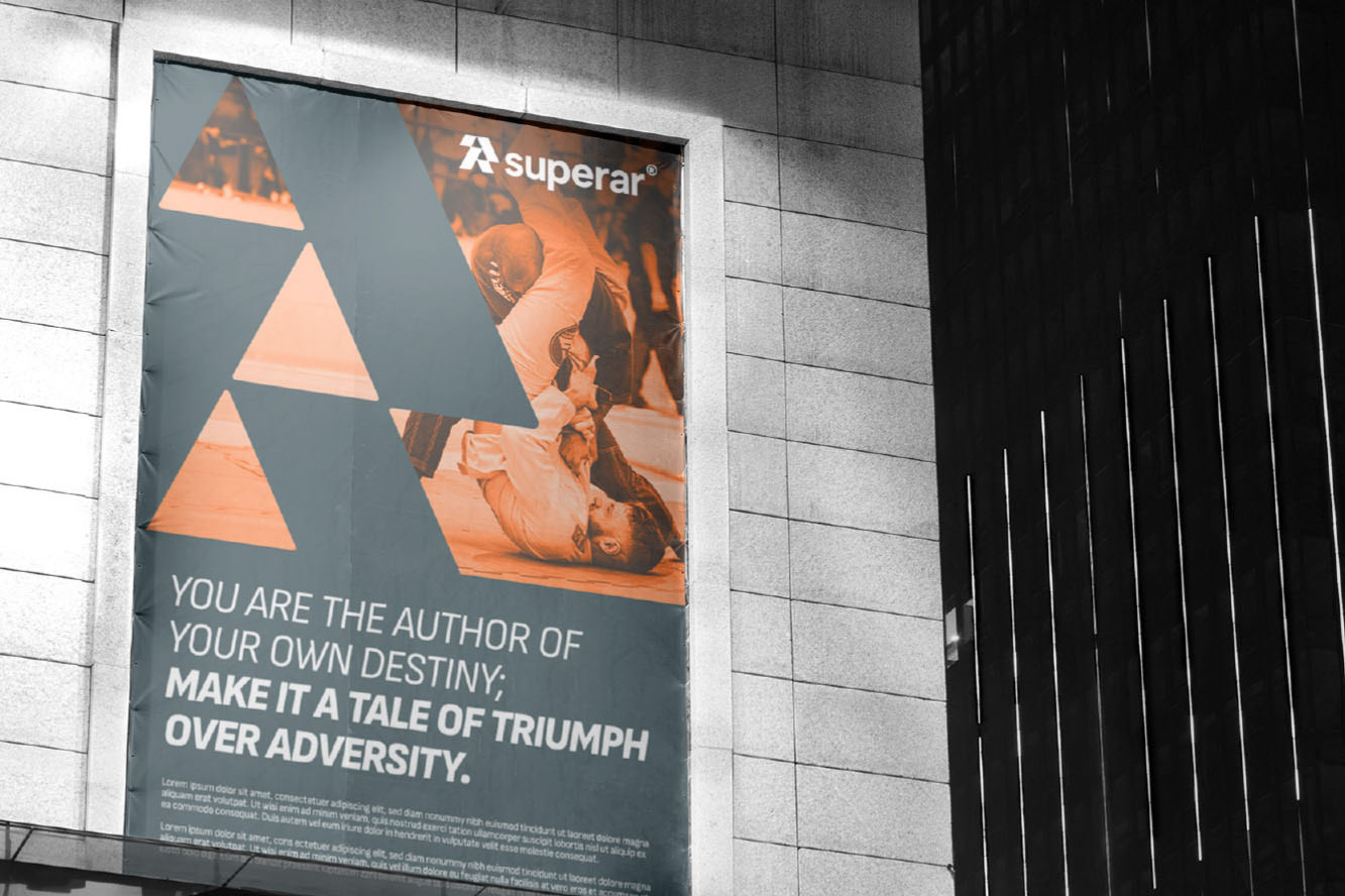
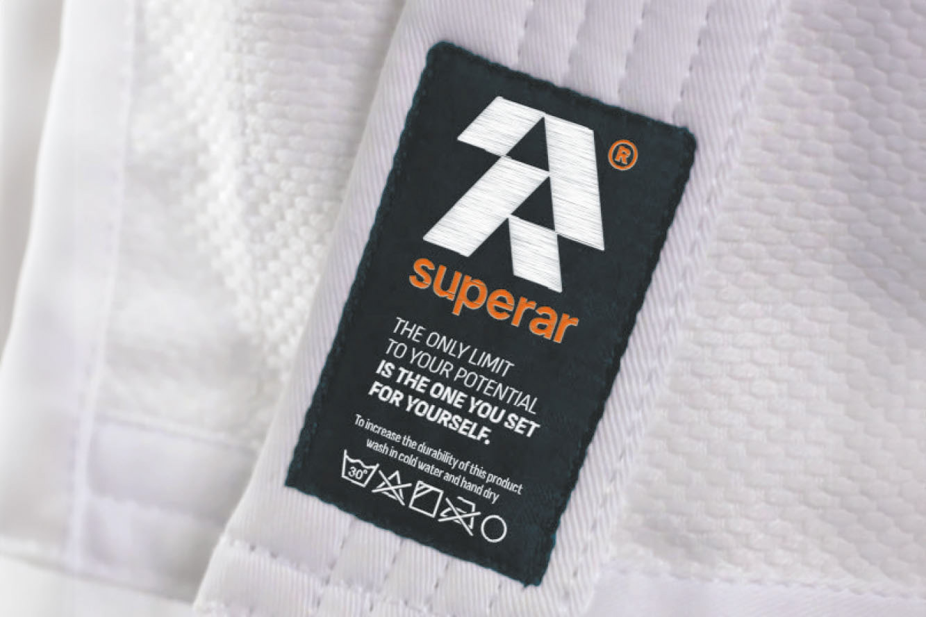
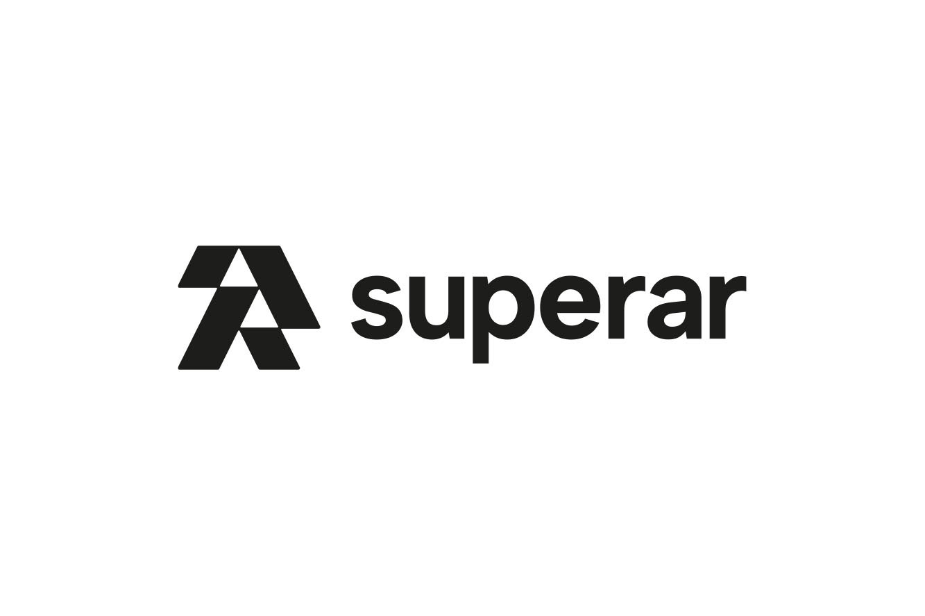
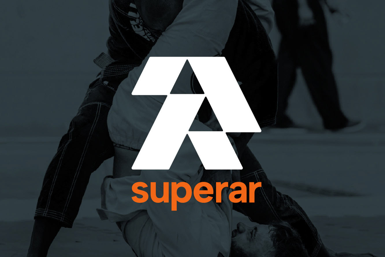
The wordmark was created with input from the client. A simple and contemporary sans-serif font was used accompanied with a minimalist logomark. The lowercase font remains cool, calm and collected over vibrant colour and intense imagery and remains professional, allowing the subject of the design and communications to take charge.
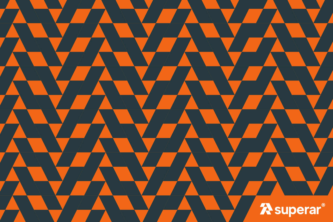
The logo mark is angular and strict and is an abstract take on a monogram ‘S’ and ‘R’. The emergence of the arrows of the negative space pointing up is positive and represents a journey, whilst the body is made up of building blocks. Suitable for a brand that empowers self improvement.
The logo mark is angular and strict and is an abstract take on a monogram ‘S’ and ‘R’. The emergence of the arrows of the negative space pointing up is positive and represents a journey, whilst the body is made up of building blocks. Suitable for a brand that empowers self improvement.
