Corporate ideals...
Active, Strong, Dependable, Proud, Honest
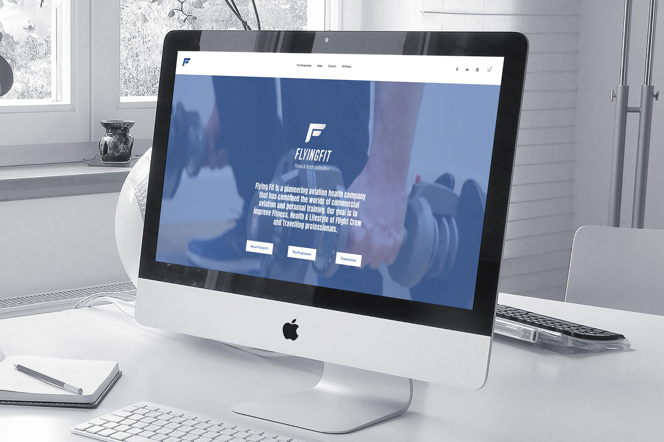
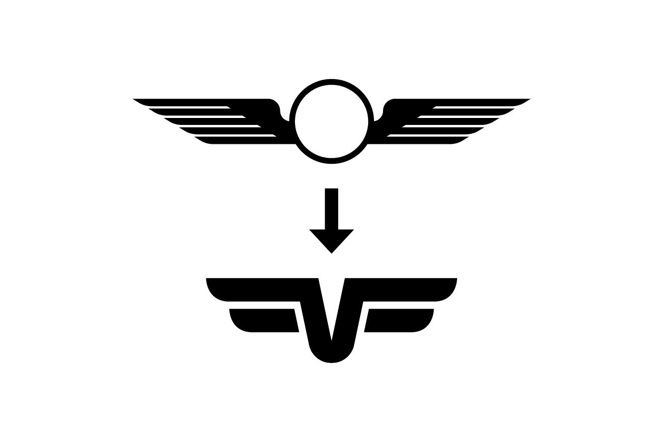
I was approached to design the logo, website and a set of health manuals. As a licensed pilot, the client wanted to associate the visual elements of the logo with aviation, using blues and yellows of the pilots uniform. The “F” is based on the pilot’s “wings”. The logo mark was kept simple so it could be reproduced in various ways, but remain easily recognisable.
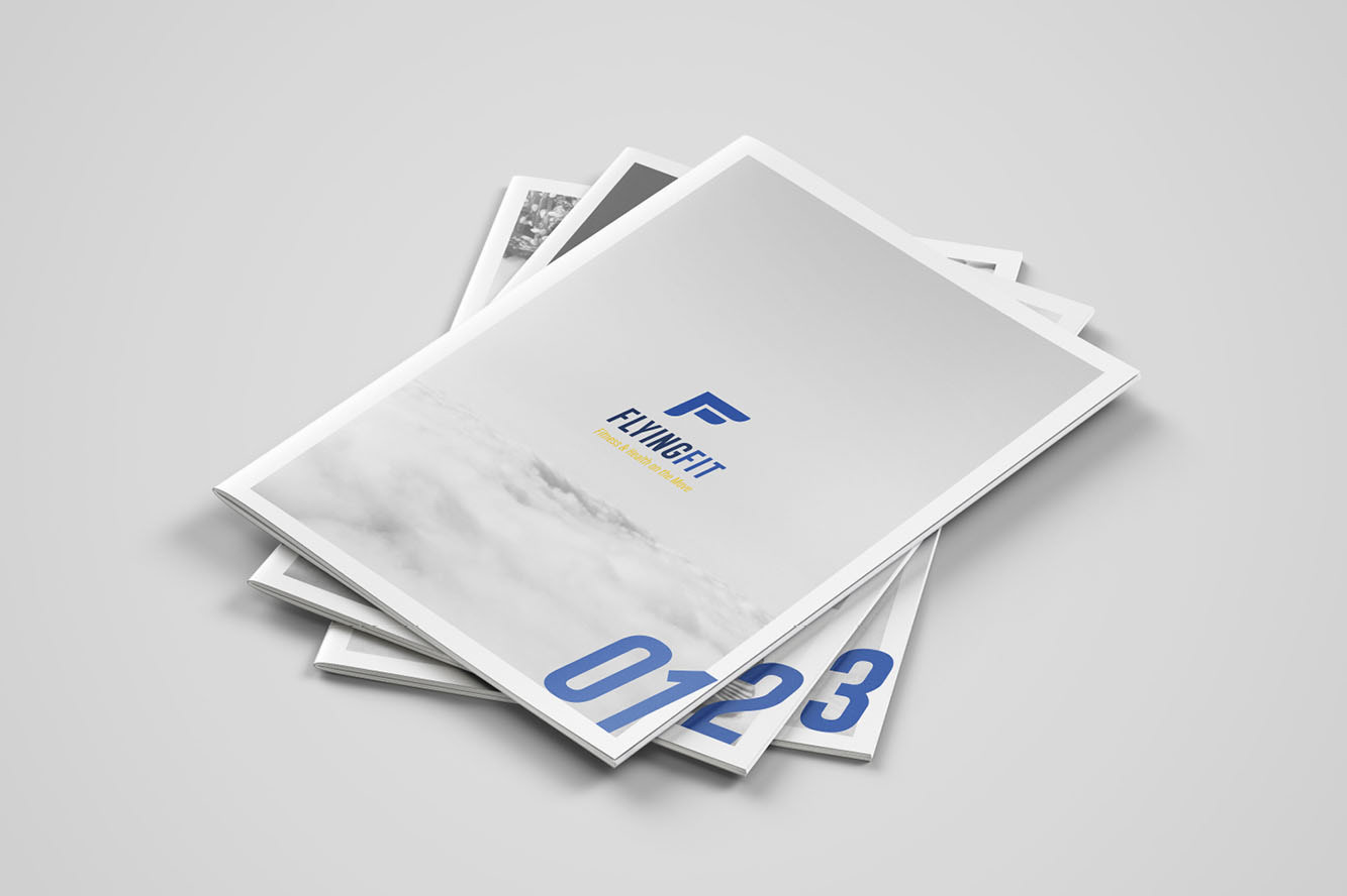
Three manuals were designed as interactive PDFs, but remained A4 for printing purposes. These are marketed towards travelling professionals and are available for purchase via the website.
Three manuals were designed as interactive PDFs, but remained A4 for printing purposes. These are marketed towards travelling professionals and are available for purchase via the website.


