Corporate ideals...
Health & Wellbeing, Luxury, High-end, Empowerment, Respected, Interlink
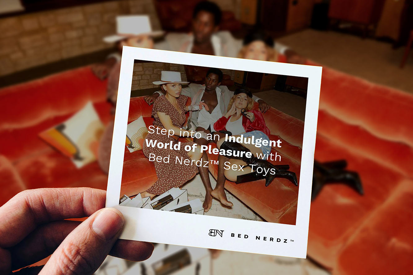
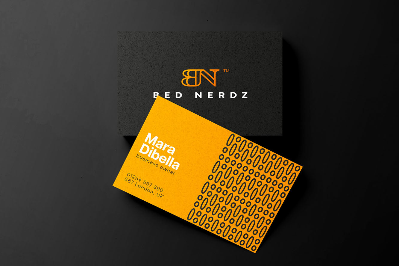
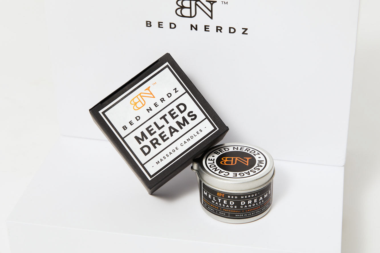
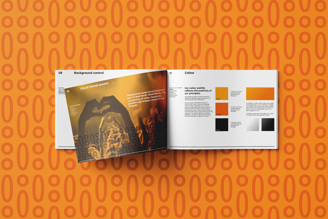
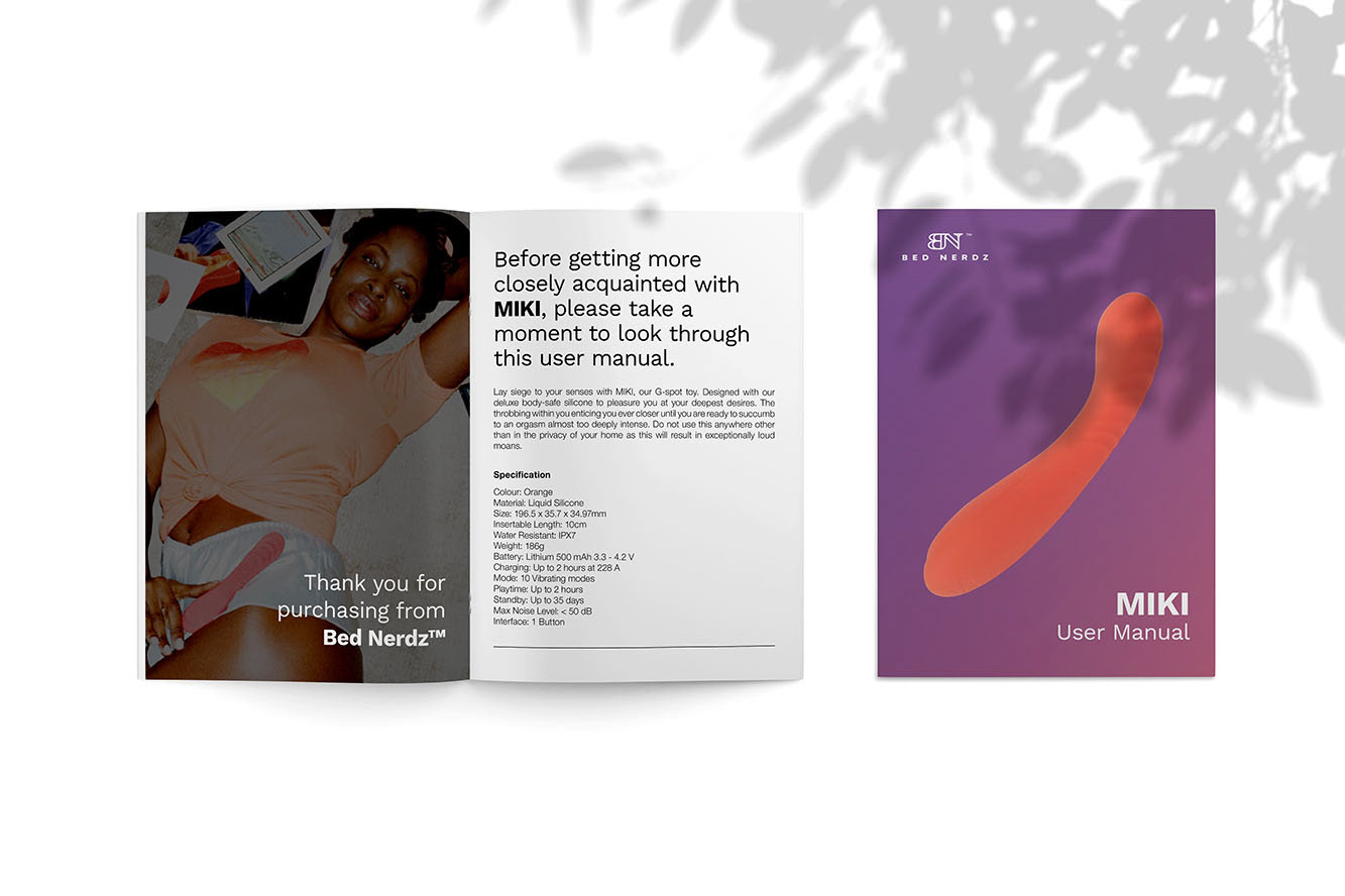
A logo and visual assets were required to identify a luxury brand with a high-end offering that would be seen by a diverse customer base. The logo and supporting brand assets were to represent a company that promotes sexual well-being and positivity and so a bright and sunny colour palette was chosen. With the logo to be debossed on all of the products, it had to work at a small scale with enough integrity that the stamping did not affect the logo structure. The monogram was built with the decorative serif typeface. Like many serif fonts it has a high-end, authoritative character. They are also seen as more traditional than compared to a more contemporary geometric sans-serif which is why I opted for clean and well-rounded (both literally and figuratively) geometric sans-serif for the signature.
